'News'에 해당되는 글 10건
- 2011.03.21 Tate : Aiweiwei 1
- 2011.01.04 Degas : Look its frame !
- 2010.12.24 Artforum : 2010 Critic's Pick _ Julia Langbein
- 2010.12.24 Artforum : 2010 Critics' Pick _ Eugenio Viola 3
- 2010.12.16 Web Site : China Artforum
- 2010.12.14 Vienna International Film Festival
- 2010.12.14 히지카타Hijikata와 사진가 호소에 에이코Hosoe Eiko의 작품
- 2010.11.12 Color : Value and Hue
- 2010.11.10 국내 전시 : Platform Seoul 11.3-11.19
- 2010.10.27 Surrealism : Giacometti + Duchamp


시카고 대학의 쥴리아 랑베인은 엘리나 브로데루스의 사진 작업과 '세컨 핸드(?)'의 작업들을 뽑았다.
Julia Langbein is a Ph.D. candidate in art history at the University of Chicago.
Julia Langbein
“La carte d’après Nature,” “Second Hand,” Elina Brotherus

Elina Brotherus, Baigneuse, orage montant (Bather, rising storm), 2003, color photograph, 27 1/2 x 31”.
Surprise is a legitimate reaction to finding one of the year’s best contemporary exhibitions in Monaco. The inaugural show at the Nouveau Musée Nationale de Monaco’s Villa Paloma, “La carte d’après Nature (The Map After Nature),” curated by photographer Thomas Demand, acknowledges that surprise. The show plays on the deep strangeness of the one-mile-squared leisure kingdom, on its heights of both nature and artifice, in works like Chris Garofalo’s intricate ceramic models of impossible sea creatures and Saâdane Afif’s absurd topographical map of a wave (Strategie de l’inqiétude [Strategy of Unrest], 1998). The artist-as-curator is one of the most interesting features of the show: For example, in designing a trompe l’oeil velvet-curtain wallpaper to surround Magritte’s paintings, he has (in his words) “taken many liberties where a professional curator might be accused of infringing.”
Liberties taken by professional curator Anne Dressen at the Musee d’Art Moderne de la Ville de Paris created the dynamism of “Second Hand,” a seven-month-long group show in which the expansive, permanent modern-survey collection of the museum was “infiltrated” by copies, imitations, and appropriations, from a Modigliani by legendary forger Elmyr de Hory to Olivier Mosset’s striped canvas Untitled, 1974, whose uniform bands are only infinitesimally wider than Daniel Buren’s. Playful interspersing of the “lookalikes” threw the spectator into investigative mode, ready to examine the authenticity of the masterpieces of the permanent collection.
Elina Brotherus’s photographs and videos have a consistent relationship with the history of painting, but one that is subtler than direct copy or citation. In a retrospective and then a follow-up show of new work at gbagency in February and March, one saw an initial confessional phase in the 1990s give way to an investigation of the compositional conventions of nineteenth-century painting, from the romanticism of Model Studies, 2002–, in which figures are viewed from the back against expansive landscapes reminiscent of Caspar David Friedrich, to the academicism of a marmoreal nude in Baigneuse, orage montant (Bather, rising storm), 2003.
이태리의 유진 비올라는 아브라모빅과 폴 매카시, Sk-Interfaces의 전시를 올해의 베스트로 뽑았다.
Eugenio Viola is a critic and Project Room curator at Madre Contemporary Art Museum in Naples, Italy.
Marina Abramović, Paul McCarthy, “Sk-Interfaces”

Marina Abramović, The Artist Is Present, 2010, Performance view, Museum of Modern Art, New York, 2010. Photo: Marco Anelli.
“The Artist Is Present,” Marina Abramović’s dazzling retrospective at MoMA, was certainly among the finer exhibitions of 2010. Beyond the complex and constant play of references in her oeuvre, the show spectacularly reasserted the presence of the artist/shaman through a durational performance and a controversial decision to re-enact her historical performances. This was a solution that succeeded on a curatorial level, where the effect was unquestionable, as well as on a theoretical level: Abramović affirmed the radical subversion hic et nunc of the performative act while managing to stall the attenuation of “presence” that is a consequence of theatrical recreations.
“Pig Island,” Paul McCarthy’s first retrospective in Italy, was also noteworthy. The exhibition at the Palazzo Citterio (organized by the Fondazione Nicola Trussardi) was a journey into the artist’s hallucinatory weltanschauung, made via residual traces of past performances and found objects, all staging outrageous situations, verging on the obscene. Each installation presented pairs of figures that challenged boundaries and broke interpretive registers. The space as neutral container was transformed by the convergence of McCarthy’s works, and therein the social dynamics of politics and culture were subjected to symbolic, devastating, tragicomic and self-satisfied bad taste.
By contrast, “Sk-Interfaces,” which closed in early 2010 at the Casino Luxembourg, disrupted the present state of affairs and exposed artistic practices thriving on the margins. The exhibition investigated the best of Biotech art by focusing on an abrupt rematerialization of the art object in the passage from net art to wet art. Here, artists––faithful seismographers of their own time––absorbed the speed of technological innovation with a lucid madness, appropriating biotechnologies and genetic engineering while participating in the gradual spread of technology and science to the world of art. Standout pieces in the exhibition by Eduardo Kac, ORLAN, Stelarc, and Art Orienté objet, among others, were emblematic of these contemporary approaches.
Translated from Italian by Marguerite Shore.

이렇게 강렬한 사진을 본 적이 없다.
자기의 얼굴을 성형하는 퍼포먼스를 보여주는 프랑스의 오를랑의 작품도, 벌거벗은 여인들이 즐비하게 나온
바네사 크로포트의 작품에서도 느끼지 못했던 강렬한 느낌을, 바로 이 사진, <가마이타치>에서 느낄 수 있었다.
잔뜩 웅크린 몸. 그건 보는 사람을 긴장시킨다.
거리에서 아주 납작하게 땅에 붙어서 사람들의 몸짓과는 아주 다르게, 거의 기어가는 수준으로 삶을 영위해나가는 사람들
시장도 아닌 대로변 구석에서 마치 식물의 한 뿌리처럼 옹크리고 앉아 야채를 다듬는 할머니들의 뒷모습.
마치 날개없는 새가 먼 곳을 바라보는 것처럼 느껴지는 안타까움. 슬픔.
김기덕의 영화에서 영영 돌아오지 않는 미군 남편을 기다리는 미친 여자처럼
슬픔과 분노가 공존하는 몸짓.
일본 전위예술의 대가 히지카타Hijikata와 사진가 호소에 에이코Hosoe Eiko의 작품이다.
1959년 5월 24일, 안보조약개정을 둘러싼 긴장감이 증폭되던 즈음, 히지카타는
미시마 유키오의 소설 <긴지키>을 각색한 퍼포먼스를 무대에 올렸다.
그 무대 위에는 동성애, 소아성애, 성도착증 등 성에 대한 모든 금기가 담겨있었다.
일본 사회에 엄청난 파문을 몰고왔던 이 작품 이후, 히지카타는 죽음과 고통, 공포와
폭력등을 표현하는 이른바 '어둠의 춤(안코쿠부토)'을 추기 시작하였다.
이를 지켜보았던 사진가 호소에 에이코와 함께 그는 1965년부터 68년까지
도호쿠 지방을 여행하며 사진 연작 <가마이타치>를 작업했다.
Color, Value and Hue
Color is one of the most powerful of elements. It has tremendous expressive qualities. Understanding the uses of color is crucial to effective composition in design and the fine arts.The word color is the general term which applies to the whole subject - red, orange, yellow, green, blue, violet, black and white and all possible combinations thereof. Hue is the correct word to use to refer to just the pure spectrum colors. Any given color can be described in terms of its value and hue. In additon, the various physical phenomena and pyschological effects combine to affect our perceptions of a color.
Value and Hue

Value is defined as the relative lightness or darkness of a color. It is an important tool for the designer/artist, in the way that it defines form and creates spatial illusions. Contrast of value separates objects in space, while gradation of value suggests mass and contour of a contiguous surface. In the drawing on the right, value contrast separates the artichoke from the background, and the separate leaves from one another, while gradation suggests the curves of leave surfaces and of the whole form.
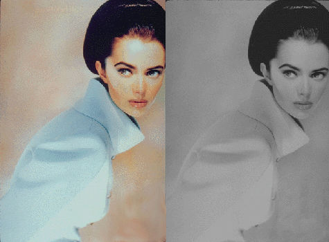 Hue also has value. When contrasting hues are made similar in value, the spatial effects are flattened out. The pair of images on the left demonstrate this. In the color image of the fashion model the coat draws our attention through contrast of hue although the skin tones blend with the background(remember the object of the image is to sell the coat, not the model). However, it also seems to be softly blending with a background that seems quite close, and is very similar to the coat in value. The face tends to blend with the background which is similar in both hue and value. In the black and white version, however, the coat virtually disappears, since only value, not hue, are available to distinguish it, and the values are quite similar. However, the strong value contrast of the eyes and hat draw our attention to the face, even though the contours of the face seem to melt into the background. Therefore the black and white version emphasizes the model more than the garment.
To summarize: If values are close, shapes will seem to flatten out, and seem closely connected in space; none will stand out from the others. If values contrast, shapes will appear to separate in space and some will stand out from the others. This works whether the colors are just black, white and gray, or whether hues are involved.
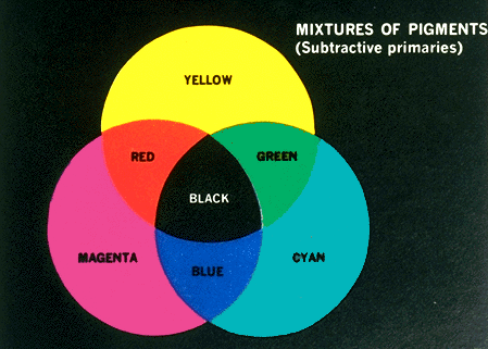 Hue is the term for the pure spectrum colors commonly referred to by the "color names" - red, orange, yellow, blue, green violet - which appear in the hue circle or rainbow. Theoretically all hues can be mixed from three basic hues, known as primaries. When pigment primaries are all mixed together, the theoretical result is black; Therefore pigment mixture is sometimes referred to as subtractive mixture.
The primary colors consist of three hues from which we can theoretically mix all other hues. There are two commonly used definitions of primary colors:

Painters Primaries - red, blue, yellow: This traditional definition of primaries does not in fact mix to clear greens or purples; it is based on 19th century theories.
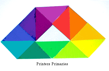
Printers Primaries - magenta, cyan (turquoise), yellow: This definition of primaries mixes to clear colors across the entire spectrum. It is used as the basis for color printing. The computer screen probably does not give you a true turquoise--the color should be a blue-green-- because of differences between color mixture in pigment and color mixture in light.
In mixing colors hues can be desaturated (reduced in purity, weakened) in one of three ways: mix with white to lighten the value (tint), mix with black to darken the value (shade), or mix with gray or the complement to either lighten or darken the value ( tone).
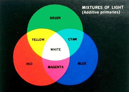 Light Primaries - red, blue, green. This definition is active when colored light is mixed, as on your computer screen, or when theatrical spotlights overlap on a white wall. Its effects are less familiar than pigment mixture to most people. If all three primaries are mixed, the theoretical result is white light. Therefore Light mixture is sometimes referred to as additive mixture.
Your computer screen mixes color as light, and therefore follows additive color mixture rules. This means that the depiction of subractive mixture shown here is less than ideal, particularly for the cyan (turquoise) and magenta of the printers primaries.
If you want to see some amazing animations of hue and value relationships, try going to this link, which will also take you to a good descriptive explanation of hues and primaries.
There are many systems for classifying hue, developed so that researchers can measure and define color qualities, and so that designers, industry, and marketing people can communicate color ideas over distance. One example is the Munsell system; another is the Pantone System. However, today the communication of precise color information is mainly done digitally, using spectrophotometers to identify and transmit color information. These digital systems use additive (light) mixture rather than the subtractive (pigment or dye) mixture used in systems like Munsell and Pantone.
Complements are colors that are opposite one another on the hue circle. When complements are mixed with one another in paint, the resuting muted tones desaturate or dull the hues. Such opposite pairs can also be compared in terms of their relative warmth and coolness. Warm-cool contrast of hue can cause images to appear to advance or recede. In this 15th century painting, for example, the warm reds of the man's doublet and his son's cap reinforce the cues of placement to make these figures seem very close. On the other hand, the cool tones of the sea and sky suggest great distance.
Afterimage is another, more specific definition of complements consisting of a stimulus color and its physical opposite generated in the eye by exposure to the stimulus color. Afterimage colors tend to make each other appear more intense, and have vibrating boundaries.
Color Illusions
Some of the effects of color occur only in the eye and brain of the viewer, and are not physical properties of light waves or pigment. These illusions, however, are very powerful, and have enormous impact on our responses to color.
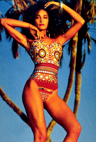
 Color Proportion refers to the impact of the relative quantity of a given hue or value used in color compositions. In order to achieve over-all unity, and/or create emphasis, one should make a clear decision as to which colors should be assigned the largest and least areas. The color proportion choice will also affect the impact of the color composition. This can be seen in the set of panels shown here. The very same colors are used in each panel. Yet depending on the choice of dominant color, the feeling of the composition, and even the appearance of each color, is altered.
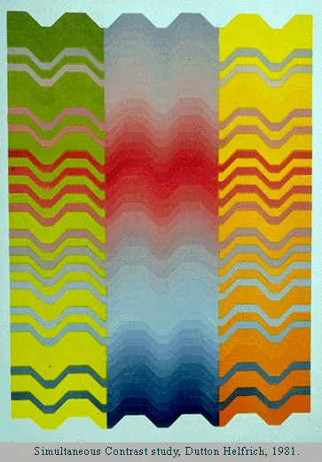
Simultaneous Contrast is the phenomenon which occurs when a color appears to change when seen against a different background. A set of principles were first laid out in the 19th century by Chevreul, a dye master for the Gobelin tapestry works, who became an important color theoretician. His principles state that changes in the hue, value, saturation (purity of hue), and area of a background color will alter the appearance of the selected color. The print shown here is made up of wavy bands of colors. Some of the bands extend from the center panel to intrude into areas of contrasting hue in the side panels. These extended bands are in fact the same hue and value throughout, but appear to change from left to right.
If you are interested in further information about how our visual response to color may vary, see this section on optical effects in color.
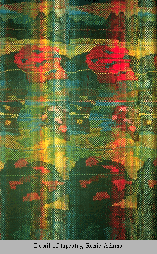 Optical mixture is the phenomenon which occurs when small particles of different colors are mixed in the eye; this type of mixture differs from pigment mixture in that it is based on light primaries. However,optical mixture differs from light mixture in which the primaries will mix to white, and from pigment mixture, in which the primaries mix to black. In optical mixture there is an averaging of hue and value, resulting in grey. Optical mixture is experienced when observing many textiles, such as this example, a detail from a handwoven tapestry. It can also be seen in natural objects, color television, and printed color pictures.
For an animated demonstration of optical mixture, try this link. Click on the small animated icon in the upper right hand corner.
Psychological Implications of Color
Market researchers have done extensive studies exploring the emotional responses of people to color. Some of these responses seem to be powerful and fairly universal. However, much of this information is culturally biased. We know that cultural traditions endow colors with powerful meanings that can differ greatly from place to place. For example, in Europe and the United States, black is the color of mourning. In many tropical countries and in East Asia white is the color of death. On the other hand, white is the color worn by American brides, while brides in much of Asia wear red. Based on research done in the United States and Europe,we know that the following associations are generally found to hold in Euro-American societies: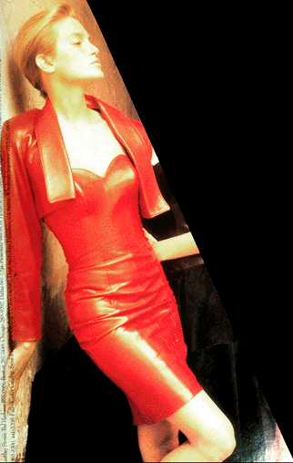
Red is associated with blood, and with feelings that are energetic, exciting, passionate or erotic. Most colors carry both positive and negative implications. The downside of red evokes aggressive feelings, suggesting anger or violence.
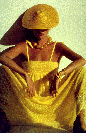
Yellow is the color of sunshine. This color is optimistic, upbeat, modern. The energy of yellow can become overwhelming. Therefore yellow is not a color that tends to dominate fashion for long periods of time.
Green In its positive mode, green suggests nature (plant life, forests), life, stability, restfulness, naturalness. On the other hand, green in some tones or certain contexts (such as green skin) might instead suggest decay (fungus, mold), toxicity, artificiality.
Blue suggests coolness, distance, spirituality, or perhaps reserved elegance. Some shade of blue is flattering to almost anyone. In its negative mode
플랫폼 서울에 아피차퐁 installation이 열렸다. 네 개의 화면에 <엉클 분미>의 화면들이 다시 등장했다.


1932. Giacometti 작. 25x28cm. 참 부끄러운 얘기지만, 이제까지 미술사를 공부하면서 정작 '형식'에 많은 관심을 기울이지 않았던 것 같다. 그러나 최근 Rothko나 Giacometti를 보면서 새삼, 크기를 비롯한 형식이 얼마나 중요한지 깨닫게 된다. Giacometti의 조각들의 흐름에 정말 관심이 간다. 왜? 이해를 못하겠으니까^^; 이 작품이 32년인데, 곧 이어 그의 유명한 인간조각이 나오게된다. 그것도 아주 쬐끄맣게.
그리고 갑자기 생각해보니, 초현실주의에 영향을 준 정신분석은 Sigmund Freud의 것 뿐 아니라, Lacan의 영향이었을까? 생각해 볼 지점이다. Giacometti의 조각은 볼 수록 신기하다.


